

Inside Miro’s onboarding emails: what you can learn (or avoid) - part 1
How a $17.5 billion company onboarded 50+ million users through emails

How to onboard +50 million users?
Miro has scaled to 50M+ users and a $17.5B valuation.
But getting sign-ups is one thing—turning them into active users is another.
I analyzed their entire onboarding email flow to see what they’re doing right, what’s falling short, and what you can learn for your own strategy.
Here’s what you’ll get:
The emails sent by Miro & where they could improve it
The overall flow → you’ll be able to duplicate it from a FigJam
An alternative flow I could have mapped for users who are difficult to activate.
Miro’s business model: How is it shaping their email flow?
Miro runs on a product-led growth (PLG) model, meaning users try the product first and then upgrade as they see its value.
Here’s how their plans work:
freemium plan → anyone can sign up and use Miro for free (but with a 3-board limit).
paid plans (team & business) → more boards, integrations, and collaboration tools.
enterprise → custom pricing, security, and admin features for large teams.
Since there’s no free trial for paid plans, the onboarding emails have one job:
→ make users experience Miro’s value quickly.
Instead of pushing for an immediate upgrade, Miro’s emails focus on:
✅ Getting users to create their first board
✅ Encouraging collaboration by inviting teammates
✅ Showcasing key features to drive engagement
The goal? Hook users early so they naturally outgrow the free plan and upgrade when they need more.
So, how does their email flow actually achieve this?
Email #1 - Verify your email
This is the well-known email verification step—a simple yet essential checkpoint. Many early-stage startups might be tempted to skip it for one main reason:
👉 Reducing friction to boost signups.
But in reality, this small hurdle helps in two big ways:
✅ Filters for more engaged users – Those willing to verify their email are more likely to explore your product.
✅ Prevents typos & lost leads – Ensuring users enter a valid email means you can nurture them effectively during their free trial.
Miro keeps it clean and to the point—no distractions.
But they could take it further by using this moment to build excitement for the product.
For example, instead of a plain confirmation message, they could set the stage with:
“You’re one step away from turning your ideas into reality.”
Rather than a basic “Verify your email” CTA, a more engaging call-to-action could be:
“Start creating your flow”

Email #2 - Welcome email — This one is 🔥
⏳ + 5 minutes
The welcome email from Miro is really cool.

✅ It feels like you’re already inside the product.
✅ Personalized design, not just text. They use data from the onboarding flow to visually place you in a teamwork setting, reinforcing their business model.
✅ Key features highlighted. The four most-used features are front and center, making it easy to get started.
What could have been even better?
Miro could have taken personalization one step further by using the job title provided during onboarding in the following section:

For example, they could tailor the email based on use cases instead of a generic introduction.
The title of the section:
How marketers craft their first Miro board
Feature 2 displayed:
Drag & drop your marketing PPT right onto the canvas
Feature 3:
Generate campaign strategies in seconds with AI.
Feature 4:
Our most-used marketing templates, ready to duplicate.
Instead of just showing features, this approach ties them to real-world use cases, making the email more relevant and actionable.
Final thoughts on the CTA:
The call-to-action is smart—it encourages users to explore value first rather than rushing them to invite teammates. Miro understands that people are more likely to invite others once they’ve created their first board.
Email #3 - The tutorial email
⏳ + 1 day since last email

The goal of this email is simple: help you get to the “Aha!” moment so that you’ll naturally want to invite your team.
It also clearly maps out Miro users' four key steps, highlighting the most important milestones before most users activate.

Let’s analyze the email:
→ The subject line is spot on—short, easy to read, and clear.
→ The content works well for a general user but seems fluffy.
👉 If they’re collecting data during onboarding (job title, team size, etc.) and don’t use it, they’re missing an opportunity by not taking personalization a step further.
Here is another version:

⚠️ I think it’s missing a clear connection to the job to be done for each user, which can vary based on their role and team size.
For example, in the “how to create content” section, the focus feels incomplete.
It’s not just about creating content—it’s about ensuring that:
→ your team can easily understand it
→ it’s a high-quality asset that adds value
What I would have done here:
Another version of this email could have been more personalized based on my onboarding inputs.
For example, instead of a generic message, they could have included direct links to the dashboards they pre-built for me during onboarding, so I wouldn’t have to start from scratch.
Then, once I began modifying a template or adding elements, they could have triggered an email prompting me to invite my team, reinforcing collaboration at the right moment.
Email #4 - Push template
⏳ + 1 day since last email

This is the fourth email, and the goal is still the same: get me to create a board and invite my team.
But this email should have been sent earlier, replacing email #3.
it does a great job of framing the job to be done with Miro by showcasing their ready-made templates. — I was expecting this a bit earlier.
The content is solid (even if the layout is slightly broken, which happens sometimes), but there’s one problem—it looks too similar to the previous email.
Receiving two emails with almost the same design back-to-back reduces impact.
When everything feels repetitive, the chances of actually engaging drop.

The only issue with this email? the CTA leads to a generic template page instead of something marketing-specific.
It’s not a dealbreaker, but they’re missing a chance to create a small wow effect.
Imagine clicking and landing on a pre-filled marketing board with relevant templates ready to use.
That small touch could make the experience feel more personalized and impactful.
What I would have done here:
I would have replaced email #3 by this one
The fourth email should have focused on a specific use case related to my job title
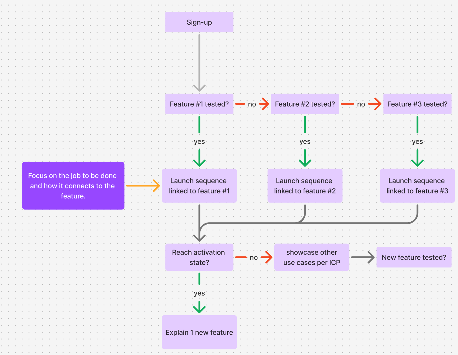
The goal of an in-app onboarding flow is to collect enough data to make the email onboarding flow relevant and helpful in getting users into the product
Here is a proven flow that works for onboarding:

If they had asked why I was starting a project in Miro, they could have helped me complete that task with a pre-made template—and from there, I could have been activated more easily peasy.
Email #5 - The use case!
I was waiting for this email earlier! But late is better than never 🤔


This works because the template is directly linked to what I might want to create in Miro—I assume it’s one of their top use cases.
The email format is also original because it’s structured as a testimonial from a Miro employee, which does two things:
1️⃣ humanizes the brand – many companies miss this, but people trust people more than faceless brands.
2️⃣ makes the use case feel real – instead of just promoting a template, they show how a successful company (Miro itself) actually uses it.
The section “Why I like using Miro for customer journey mapping” is a classic testimonial-style approach that promotes the product in a way that feels less pushy. (though, in my opinion, they could have made this section even stronger.)
Both of these elements add credibility to the email and the template, and I wouldn’t be surprised if it performed really well.
The best part? You can easily apply this to your onboarding flow—even if your brand isn’t as well-known.
It’s great for your customers to see that you actually use your own product.
What I would have done here:
Here’s the copy I would have used in that email to make it more customer-focused while keeping its original DNA.
Section 1:
[Video placeholder]
Hey {{first_name}},
I’m Maureen, a product designer at Miro, and I know how tricky mapping a customer journey can be:
forgetting key touchpoints,
dealing with scattered insights,
struggling to connect the dots between steps.
That’s why I’m sharing this structured framework in Miro, which you can duplicate —watch the 3 minute-video above to see how I use it to:
✔️ Map key customer touchpoints in a pre-built timeline
✔️ Organize insights and next steps—without messy spreadsheets
✔️ Collaborate with your team to improve the journey in real-time
This template is a great place to start if you're new to journey mapping.
[try out the template]
Section 2:
Why I love using Miro for customer journey mapping:
→ Everything stays in one place – no more jumping between docs, slides, and spreadsheets to track insights.
→ Collaboration is seamless—teams can brainstorm and refine the journey in real-time. You’ll never lose important feedback.
→ AI speeds things up – Miro AI helps generate user stories, pain points, and key takeaways in seconds.
I’m reaching the email limit, so I need to split Miro’s flow into two parts.
In two weeks, we’ll cover:
• The last emails Miro sent to convert me
• The overall flow → (you’ll be able to duplicate it from a FigJam)
• An alternative flow that I could have mapped for this use case: users that you’re struggling to activate.

solid analysis!